Your scan has just been delivered and your client is thrilled. So what else can you do to get the most out of your virtual tour? Once you’ve added the tour to your listing and shared it with potential buyers on your list, you’ll be able to see some really valuable data on your Little Hinges Insights Portal.
In this article, we break down exactly what you’ll see in the Insights Portal, and how you can turn that data into real-time, actionable insights that will wow your vendor and get your listing sold faster, and for a higher price.
What is my Insights Portal?
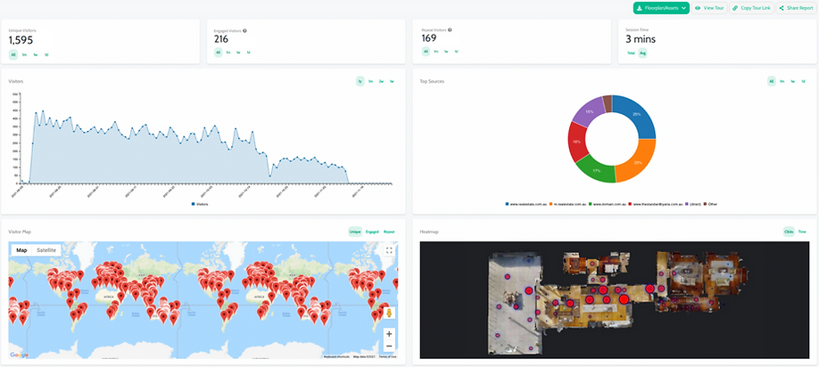
The insights portal is exactly what it sounds like – a digital dashboard that’s full of insights relating to your virtual tour. Your insights portal is your secret weapon.
From your portal you can tell exactly how many people have viewed your virtual tour, how long they spent browsing, and what aspects of the property caught their eye.
You can then share this information with your vendor to help demonstrate your success, or use the insights to better target your sales pitch to potential buyers. For example, your insights portal will show you that people are loving the outdoor pool space – so you can make sure you mention this feature when you speak to other interested parties.
How do I access my Insights Portal?
When your tour is delivered, you’ll be provided with a link to your insights portal. Check your tour delivery email and bookmark the link so you can refer back to it easily.
When your first tour is delivered, you’ll be asked to create a login and password, and you’ll be able to see all of your tours. You can also switch between tours to view the stats of all of your current virtual tours.
What data does my Insights Portal show?
Plenty! Let’s get into the numbers.
1. Unique Visitors
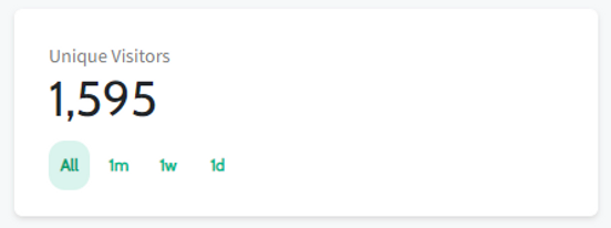
This is the number of visitors who have viewed your virtual tour. Think of it as groups through your open home. The higher the number of visitors through your tour, the greater the exposure your listing has had. Agents that use their tours as part of their REA listing typically see around 500 unique visitors through their tours.
2. Engaged Visitors
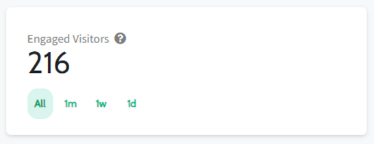
People who have spent more than 2 minutes walking through your virtual tour. These are people are the equivalent of the potential buyers who start measuring up the cupboard space and imagining how their couch will fit in the lounge room.
3. Repeat Visitors
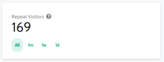
People who have visited your virtual tour more than once. They like the property and are now looking more closely at how it suits their lifestyle. They might have already seen the property in real life, or are planning to very soon.
4. Session Time

The average amount of time a potential buyer will spend looking through your tour. This can be impacted by the size of the property, but most high performing tours will see session times of around 3 minutes.
5. Visitors Over Time
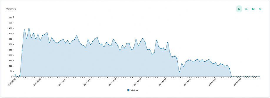
Track how your campaign is performing over time. Most campaigns will see an initial spike in activity when the tour is shared to realestate.com.au for example, and will gradually drop over time. You can match campaign activity to spikes in traffic to see what’s working, for example, if you send out a link to your virtual tour to your email database, you should see a corresponding increase in traffic to your listing. This can help you identify what marketing activity is most successful and allows you to repeat that activity for future campaigns.
6. Top Sources of Visitor Traffic
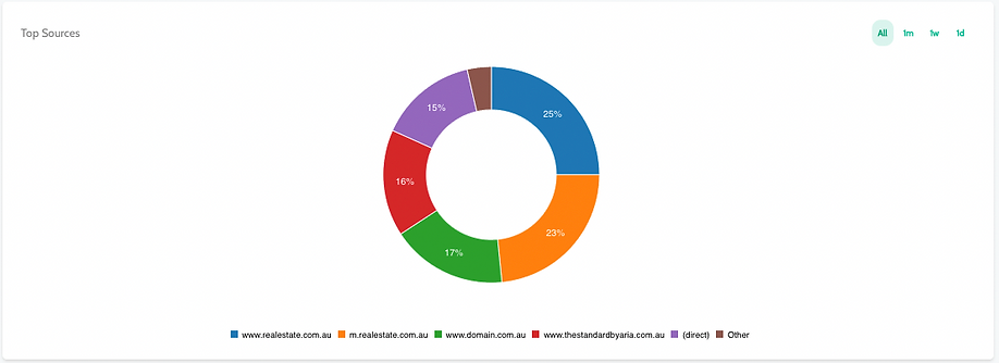
Analyse which marketing activities are generating the most traffic with this graph, which highlights how those visiting your virtual tour found you. Usually, you’ll find most of your tour traffic comes from people finding your tour on the major real estate websites like realestate.com.au and Domain.
7. Visitor Map
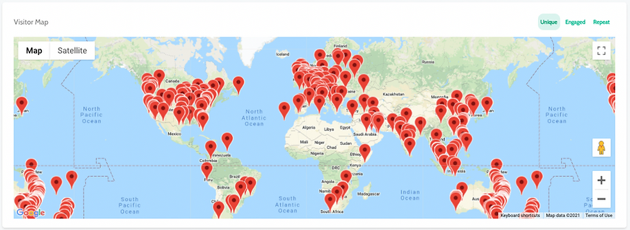
Most agents love this one, and vendors do too. This graphic shows where in the world people are viewing your tour from, and is particularly interesting when you consider the increase in sight unseen purchases during the last 18 months. You can also sort your visitor map by all visitors, engaged visitors or repeat visitors, so you can really drill down to find out where those potential buyers are coming from.
8. Heat Map (Clicks)
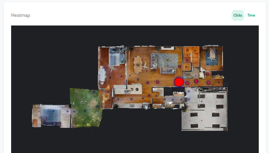
This graphic shows where most people are clicking on your virtual tour. It can show you what they are most interested in about the property.
9. Heat Maps (Time)
As with Heat Map Clicks, this graphic shows where people are spending the most time in your virtual tour and can show you what people are most interested in about the property.
You can sort all of the data in your dashboard based on the last day, week, month or by all time, and all of the data is shown in real time.
What Can I Do With My Dashboard?
You can use your dashboard to:
- Get your vendor excited about the interest you’re generating in their property. Vendors particularly love to see where potential buyers are viewing from around the world, and talking to them about the number of engaged viewers can help you frame conversations about offers and pricing. Get a shareable link to your dashboard by clicking ‘share report’ in the top right corner of your dashboard.

- Download your floorplan you ordered with your virtual tour.
- View or copy a link to your tour that you can send to your vendor or potential buyers.
- Keep track of how different properties on your books perform and use that data to plan out future marketing campaigns. If you’re seeing lots of buyers coming from a particular website or style of email newsletter, then you can double down on that activity moving forward – or equally, pull back on what doesn’t seem to be resonating with buyers.
- Get insights into the features of properties that are getting buyers excited, and use this intel to play up those features in future marketing campaigns.
- Track your performance – there’s nothing like the rush that comes from seeing the number of people walking through your virtual open home at all times of the day or night continuing to grow!
Video overview
Still have questions about your dashboard? Talk to one of our friendly team at 1300 BOOK VT or book your next virtual tour today.


